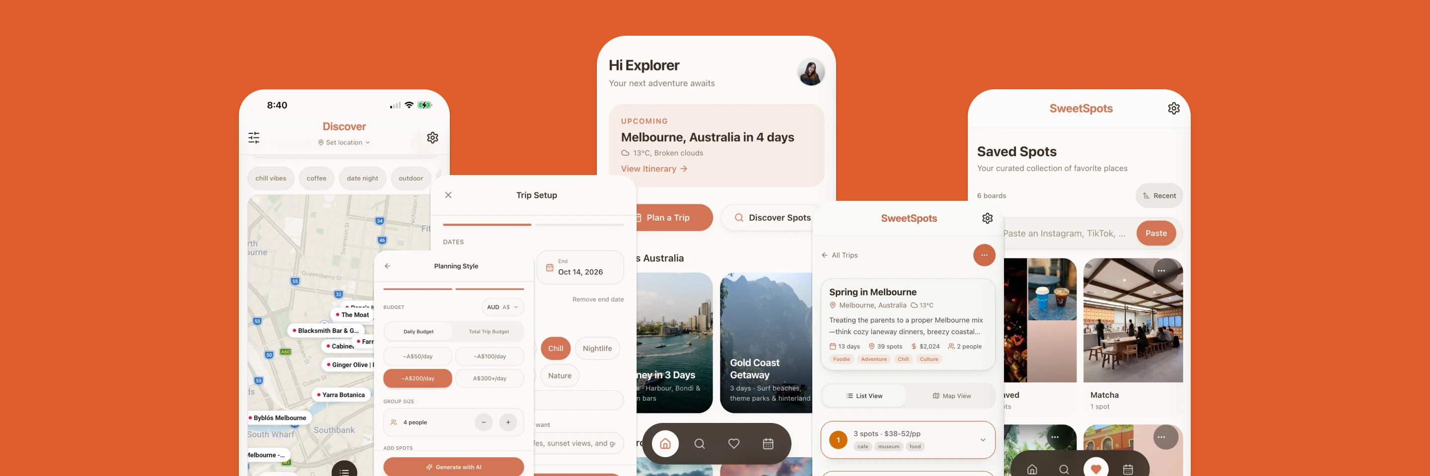
SweetSpots started as a place-discovery app and has gone through six product shifts, each triggered by a real insight. It's now an AI-powered trip planner that helps groups turn scattered ideas into a clear, shared itinerary. I've built and positioned it from two seats at once, as the designer and as a co-owner accountable for whether each shift was a good bet for the business.
"SweetSpots has gone through 6 major product shifts, and here's the story behind every one."
The Journey, at a Glance
v1
Swipe → Select
Swiping felt fun but users weren't making decisions. Goal was decision-making, not browsing.
v2
Onboarding → Keyword
Long onboarding questions came before any place. Moved to keywords users can tap or type straight away.
v3
Select → Discover by Mood
Shifted to mood-first discovery. "Your personal guide to places that match your vibe."
v4
Discover Landing → Template Home
Discover as the landing page used a lot of API. Moved it to the second tab and made Home template-based.
v5
Browse → Decide → AI-Generated Plan
Deciding wasn't enough, users still built the plan themselves. Now they describe their trip and SweetSpots generates it.
v6, Now
Itinerary → Collaborative Planning
Friends were still coordinating via WhatsApp. Shared trips, voting & collaborative editing became core.
This is a launch ad, not a case study slide, but it says the problem better than I can: planning a trip the old way sucks. Everything below is the six-shift history of trying to fix that.
Has sound, tap play.
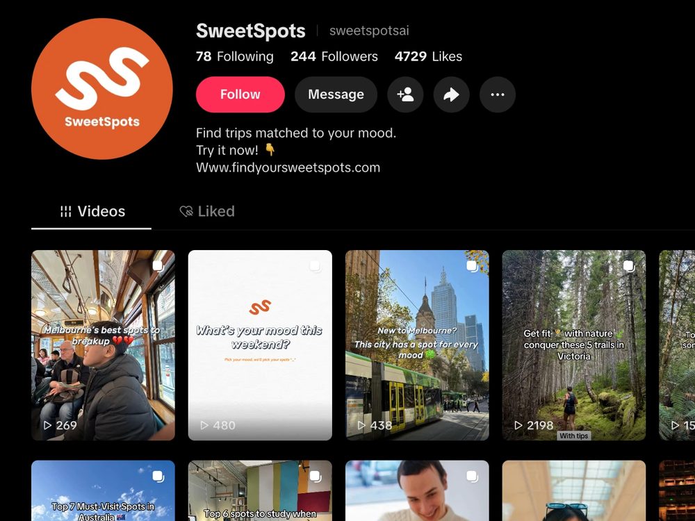
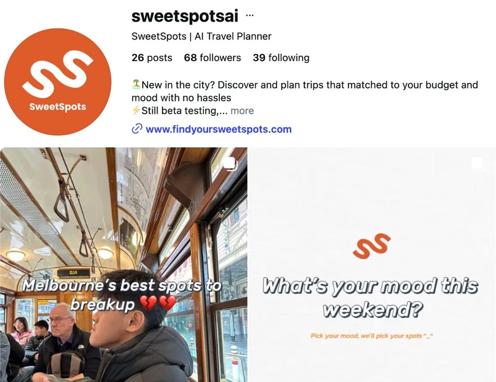
We share SweetSpots through short videos and posts. Tap a card to see the real accounts.
On my other work, I designed for the user. On SweetSpots, I'm also the one deciding whether a design decision is a good bet for the business. This page walks through both lenses side by side, phase by phase.
What user problem wasn't being solved, and what changed in the product to solve it.
Why that shift mattered for the business: positioning, differentiation, cost, or retention.
Six shifts, each moving SweetSpots closer to the real problem: turning scattered ideas into a clear, collaborative trip plan. Not every shift was purely a design call either, some were forced by the business itself: an API bill running hotter than expected, a screen that quietly cost more to run than it was worth.
We went with swiping because it made choosing easier for users, inspired by Tinder. But in testing, people sometimes didn't want a specific place right then, they wanted it later. That's a different use case from Tinder, so we shifted to selecting and saving places.
Swiping was harder for the business to get leads from. Every swipe left meant less benefit for the place.
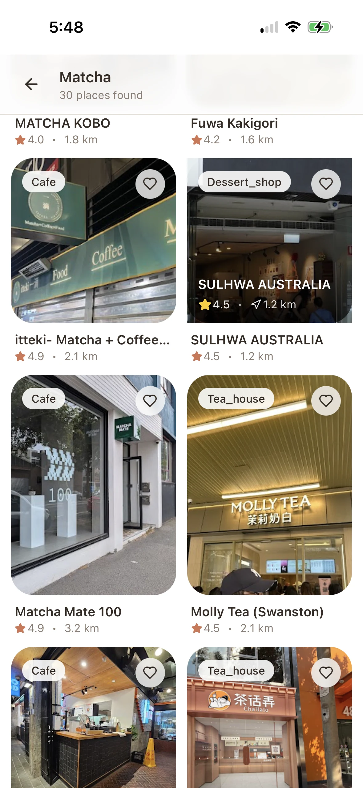
I wanted the onboarding questions to make users feel personalised, so the system could learn what they want. But we learned some people found them annoying and just wanted to see places straight away. So we cut it down to one question, where users pick their own keywords or skip it entirely.
No business lens at this stage. The call was purely about user experience, and it's the first time I noticed that onboarding friction is also a business risk.
We learned that making it effortless to start is what gets people discovering. Tapping a keyword is easier and quicker than typing out a search, so mood and vibe became the fastest way in.
User behaviour has become very prompt-heavy, so keywords alone can't meet what people expect anymore. Keywords turned out to be a good starting point, not the destination.
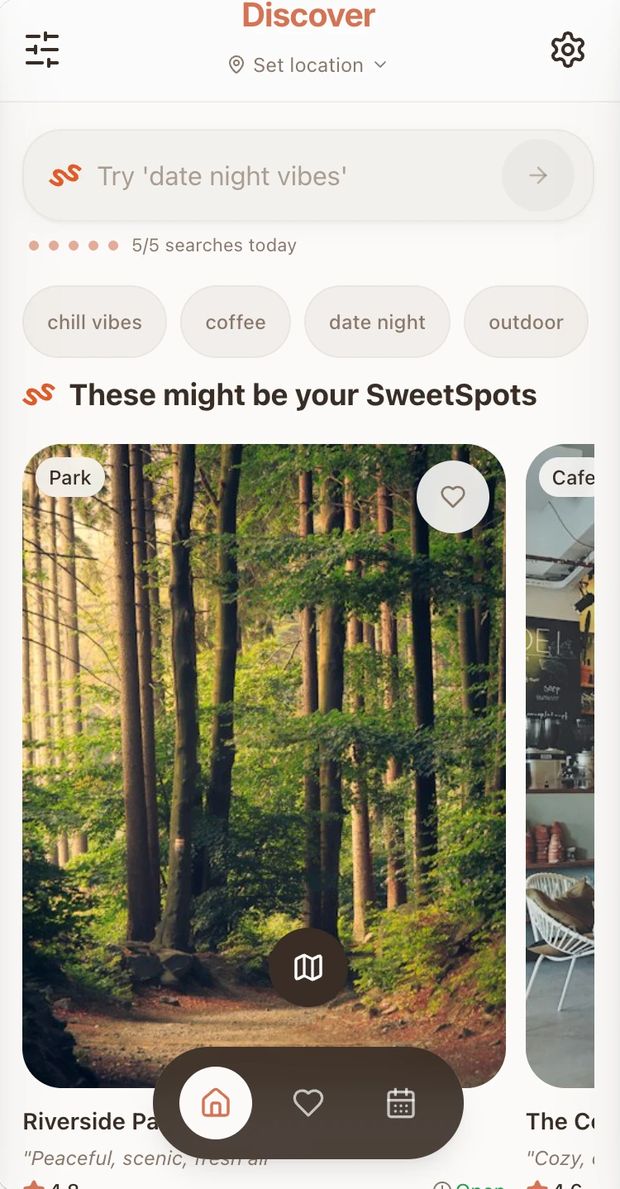
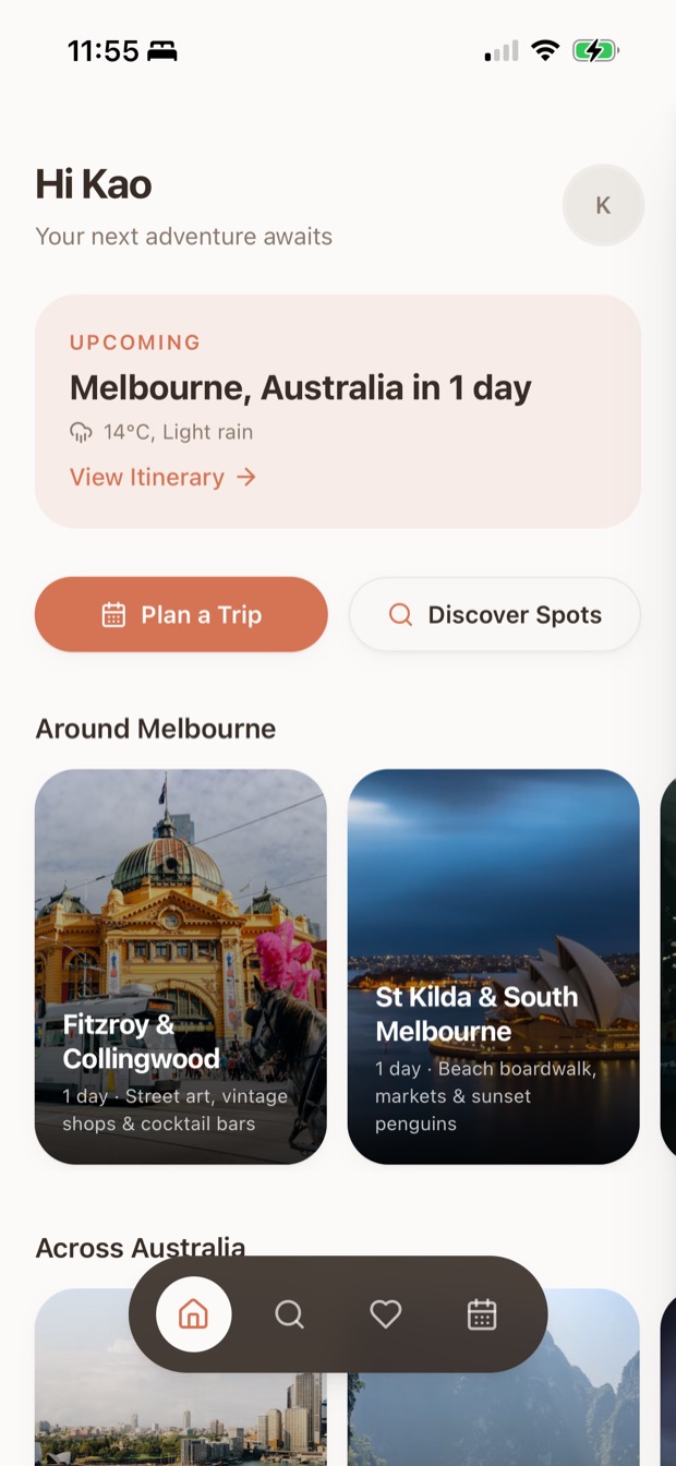
New users need something to start from, so Home now gives them inspiration: your upcoming trip, Plan a Trip and Discover Spots, and ready-made one-day itineraries. Discover moved to its own second tab.
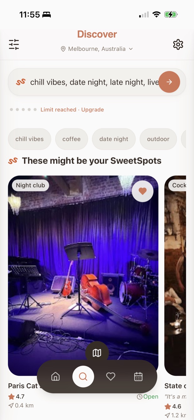
Discover was our landing page, so every app open called the API, and with about 10k uses a day that added up fast. We moved Discover to the second tab and made Home template-based, which cut API calls on app open by about 80%. We also made search a paid feature: free users get 5 searches a day. Templates also open the door to influencers creating trips on the platform, so people can follow an influencer's footsteps on their own trip.
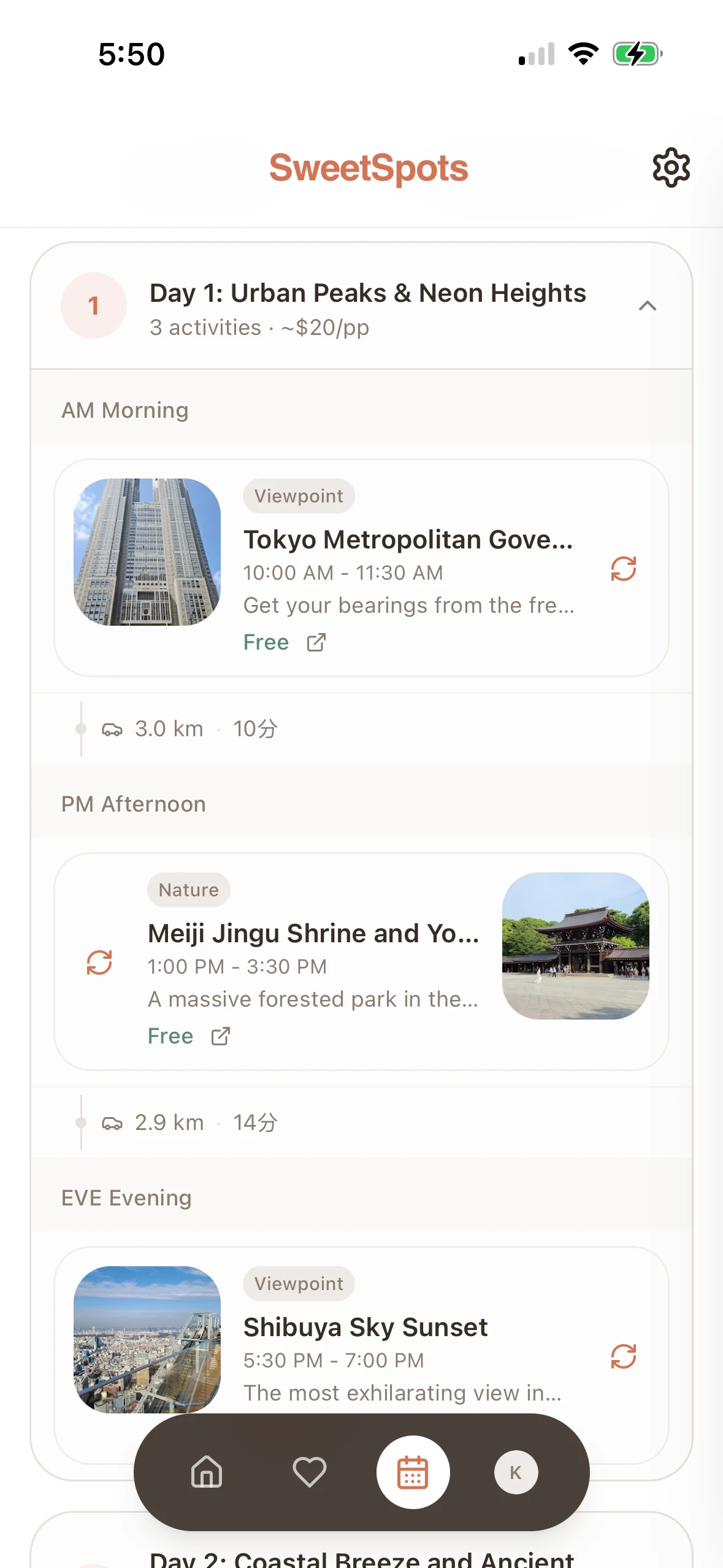
Boards, top picks and voting helped users decide, but users still had to build the plan themselves. Now they describe their trip (destination, dates, vibe, what they want) and SweetSpots generates a day-by-day itinerary with time and distance worked out. AI isn't forced on the user: they can still plan with their saved places and refine the result.
Every place a user browsed meant another Google Places API call, so endless discovery was quietly one of our biggest cost centers, and Google's natural-language discovery was commoditizing "vibe search" anyway. Generating the plan from a described trip protects our differentiation and our margins.
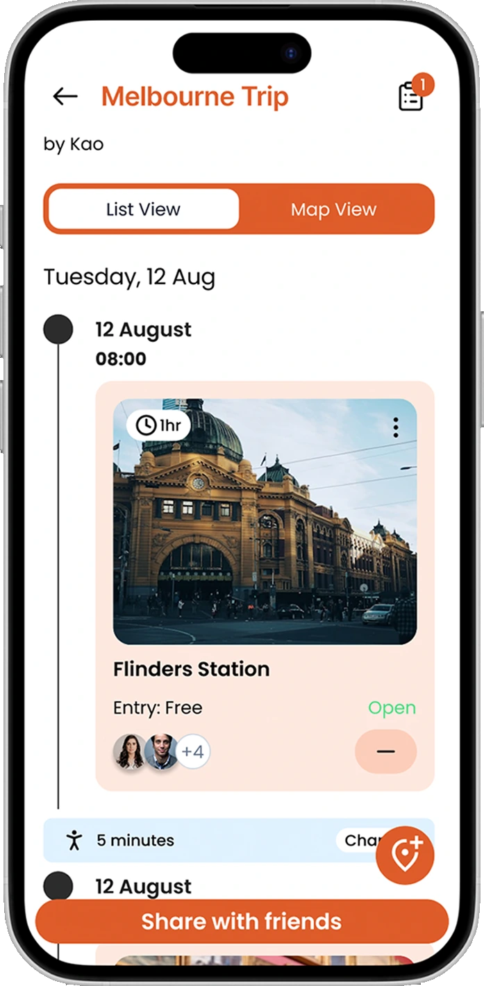
Replaced WhatsApp threads and screenshots with shared trips, invites, and group editing.
Every shared trip doubles as an invitation. Anyone with the link has to sign in to SweetSpots to view it, so each plan a user shares brings new people into the product. Planning together becomes a built-in referral loop, with growth coming from the product itself instead of ads.
This isn't a "we're better than everyone" chart. It's a map of what each app actually solves, and where SweetSpots' gap is.
Organizes existing bookings and confirmations into an itinerary, not discovery-led.
Closest functional overlap: collaborative itinerary, maps, saved places, AI features.
Sits between discovery and planning: vibe-matched places, planned together, assembled by AI.
AI/chat-led itinerary generation, less collaborative and social.
Increasingly offers natural-language place discovery, the trigger for SweetSpots' pivot.
Core discovery, planning & collaboration free to users; monetization deferred to grow the network first.
Local businesses surfaced to users who match their vibe; commission-based (roughly 10 to 18%) plus coupon-style offers (roughly 10 to 20%).
The core flow, screen by screen.
The original "find places by vibe" concept, shows the starting point.
ChatGPT-like interface where users describe their trip, the strategic pivot.
AI-generated vs. Create My Own, AI isn't forced on the user.
The core output of the product, likely the most important screen.
Pinterest-style boards, scattered ideas turned into organised places.
Destination-specific places to add to the itinerary, the hybrid planning model.
The social / group planning side.
The marketing site sits next to the app, with the same vibe-matching pitch and the same promise: spend less time planning and more time going.
We make planning fun again. Discover spots you'll actually want to go.
Swipe through spots that actually match your vibe, hidden cafés, chill beaches, or late-night hangs. Sorted in minutes.
One app, one plan. Vote on spots, drop ideas, and keep the whole squad on the same page.
Live updates for weather, opening hours, and last-minute changes, so your trip vibes never die.
How SweetSpots makes money
Best for casual solo planners
Perfect for short trips & visitors
Up to 3 friends, best for frequent travellers & groups
Where SweetSpots stands on the way from idea to paying users. Five stages are done, and beta testing is the one still ahead.
Problem Validation
100+ interviews, 350+ commentsIdeation Validation
Alpha Testing
Social Media Outreach
Community Outreach
Beta Testing
100 spots / hidden gems, business lists, event partnershipsOn other projects, a screen was done when users liked it. Here, every screen also had a running cost. Discover looked great as the landing page, but it called the API on every app open, and moving it behind a second tab cut those calls by about 80%.
Now I ask what a screen costs to run before I decide how it should look.
Behind the scenes: the day we pitched SweetSpots live at the Fastrack accelerator final.